Domoishi
Advance dining and ordering experience
Domoishi is a restaurant that blends Japanese cuisine with modern lifestyles. With a focus on traditional Japanese dietary culture and aesthetics, it encourages customers to personalize their dining experience, promoting a playful exploration of flavors and ingredients.
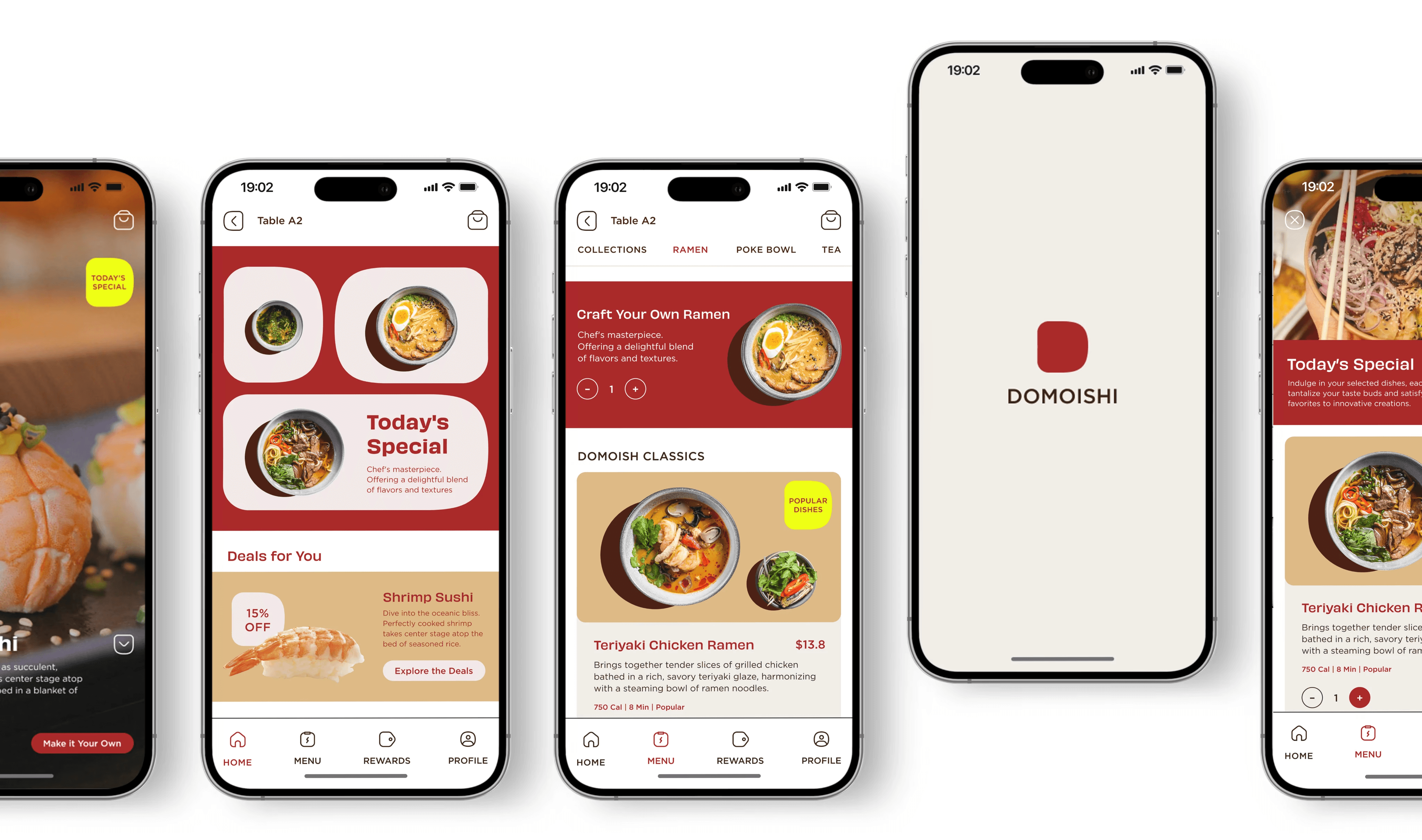
This app allows customers to explore the restaurant's menu and dining concept, place orders efficiently, tailor their preferences and tastes, and enjoy a fusion of traditional and modern Japanese dining experiences.
Client
Domoishi
Role
UI & UX Design
Visual Design
Team
1 UI & UX designer
1 Product Manager
4 Developers
1 Stakeholder
Duration
8 Weeks
Aug 2023
Problem & Hypothesis
Problem
Domoishi offers customization options for ingredients and flavors, yet its ordering process is somewhat intricate, leading to low efficiency in ordering. Although Japanese cuisine emphasizes fresh, seasonal ingredients, the restaurant falls short in effectively highlighting its signature dishes, resulting in ingredient wastage. Moreover, the traditional ordering system's lack of transparency in waiting times occasionally prompts customers to abandon their orders.
Hypothesis
An ordering app that can provide custom self-orders can simplify and speed up the ordering process, raise awareness of signature dishes, and build connections with customers.
Research
Background Research
I thoroughly observed Domoishi's dining process, discovered that the ordering system was overly complex, disorganized, and lacked consideration:
Domoishi offers users the ability to customize ingredients and flavors, which can be overwhelming due to the amount of information presented.
The way of ordering through waitstaff and menu often left new customers, particularly those unfamiliar with Asian food, feeling uncertain about how to proceed.
Research Goals
01
Understand who the target users are
02
Find out their dining habits when eating out
03
Identify the pain points users encounter during the ordering and dining process at Domoishi
04
Understand the processes and experiences of using competitive products, identify areas for improvement
User Interview
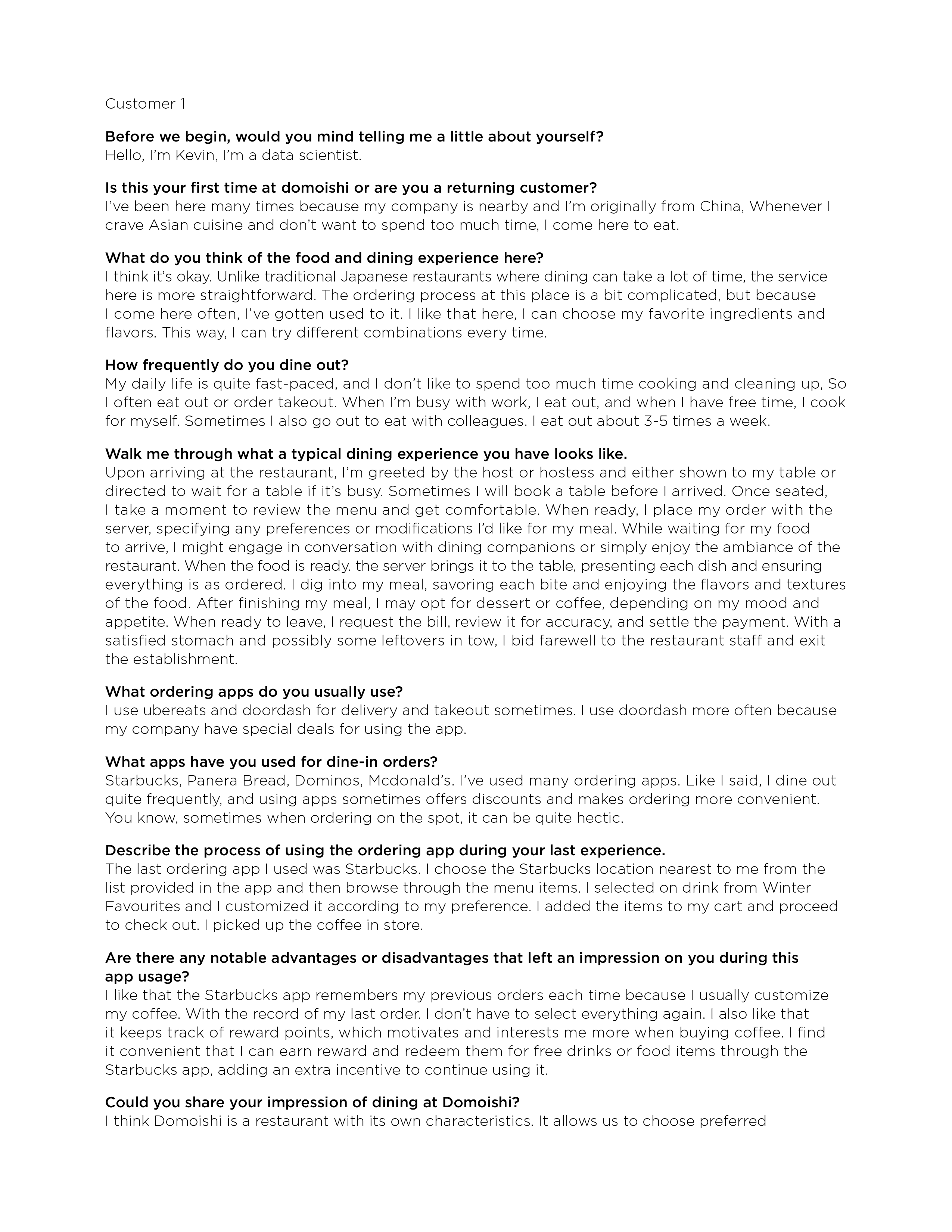
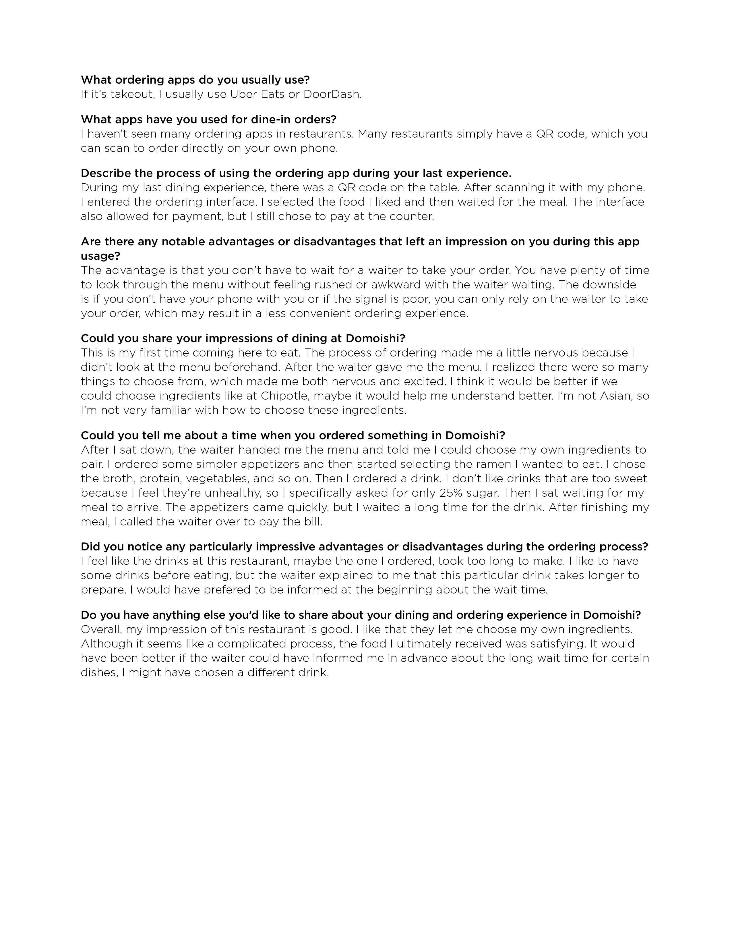
I conducted interviews with 5 Domoishi customers, 3 of whom were returning customers and 2 were new. Through these interviews, I gained valuable insights into my target audience's experiences with Domoishi and identified their pain points.
Research method: User interview
Interviewees: 5
Duration of each interview: 30 minutes
Characteristics of the interviewees: Domoishi's customers during peak hours
Questions: 8
Sample Questions
“Walk me through what a typical dining experience you have looks like.”
Find out the dining habits of the target user.
"Describe the process of using a ordering app during your last experience."
Identify the strengths and weaknesses of potential competing apps.
“Could you tell me about a time when you ordered something
in Domoishi?”
Discover the pain points of users when ordering at Domoishi.
Interview Notes
Pain Points:
The ordering process is complicated.
Lack a way to note customization preferences.
Already have preferred combinations and specific requests, but still have to reorder from the start every time.
The wait time for some dishes is too long, and there's uncertainty about how much longer it will take, leading to customer complaints.
The specialty dishes are often ordered in small quantities, leading to the wastage of fine ingredients.
Competitive Analysis
My goal of researching the competition was to find inspiration on features and design system.
What I took away:
01
It's important to innovate in functionality to adapt to the restaurant's unique customer needs.
02
It is important to consider all the stages so users can have a better experience.
03
It is important to maintain good design system consistency.
Synthesize
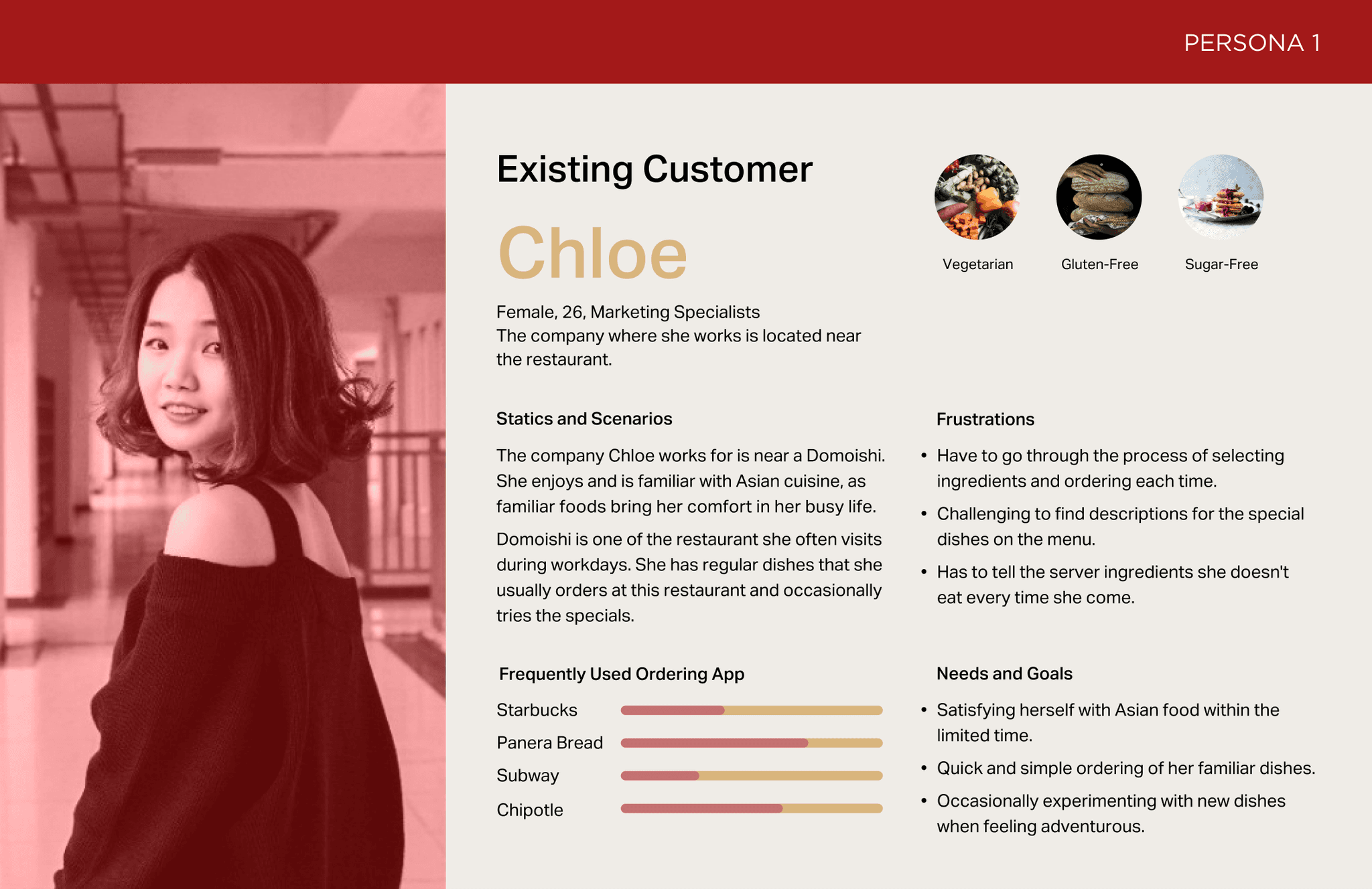
Persona
Based on the interviews, I created two different personas to uncover the issues faced by diners. These two user personas represent a new diner and a returning customer.
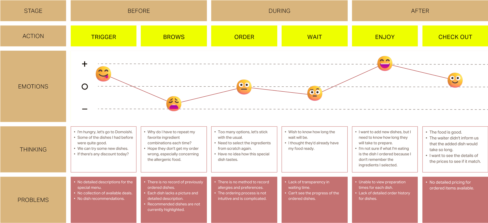
User Journey
The user journey visually represents in-store behaviors and emotions experienced in the current state without the app. The conclusion was that using a paper menu to order at Domoishi is frustrating, and waiting is also anxiety-inducing. Therefore, I designed the Domoishi app to solve these problems.
Insight
Problem reframe
01
Ordering customized dishes through the menu and the waitstaff is somewhat inconvenient.
02
It’s frustrated to repeat their preference and chosen ingredients for returning customers
03
Need an effective and attractive way to showcase the special dishes
04
It is necessary to provide the preparation time for each dish so that customers can choose according to their own time constraints.
Key Features
Ideate
Site Map
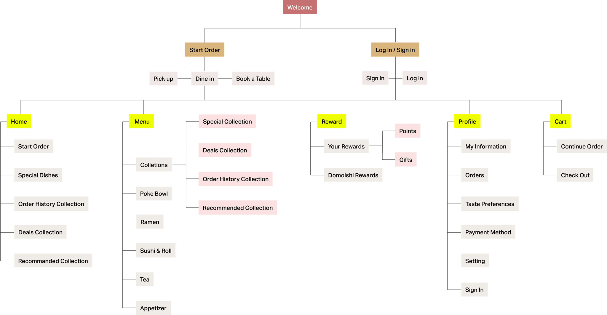
I created the site map based on the key features, dividing the screens into five main sections: home, menu, rewards, profile, and cart.
Wireframe
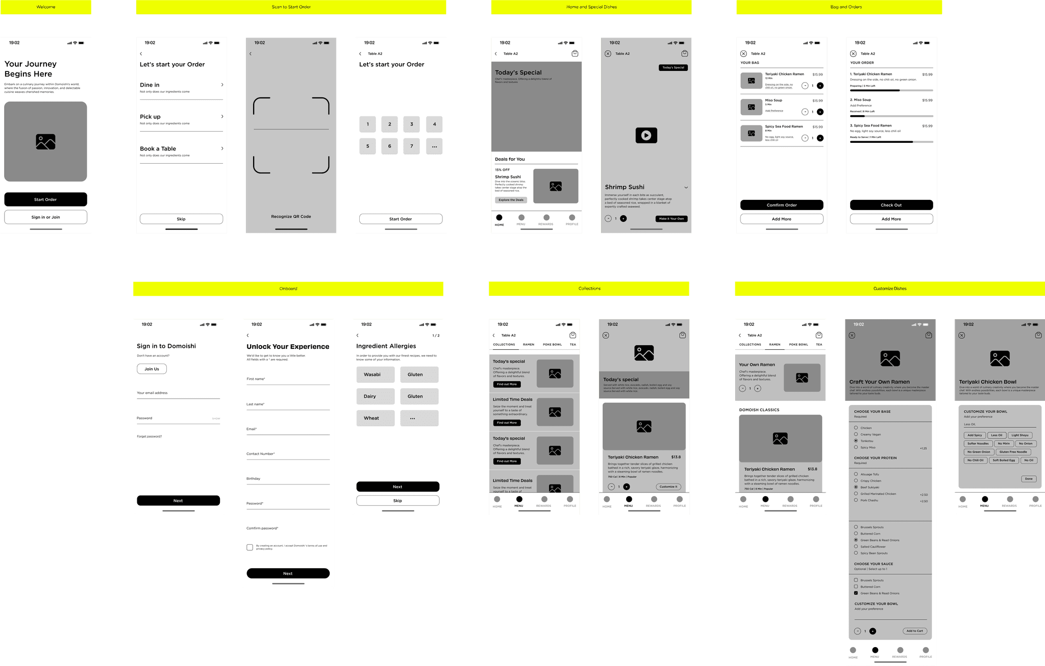
I developed a wireframe to map out the user flow and design. This wireframe helped me to outline the structure and arrangement of content and elements. This process also enabled me to identify design flaws and address them by considering the users' perspective.
Design System
Branding
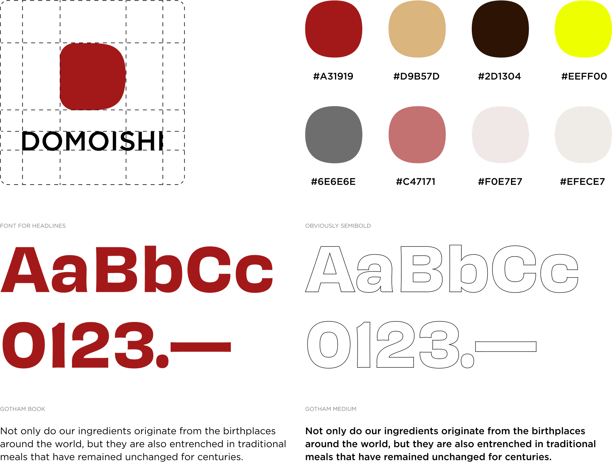
I also created a visual identity which includes a logo, fonts, color and brand themes.
UI Elements
Based on the logo's graphic, I designed a set of UI elements.
Final Design
On Boarding
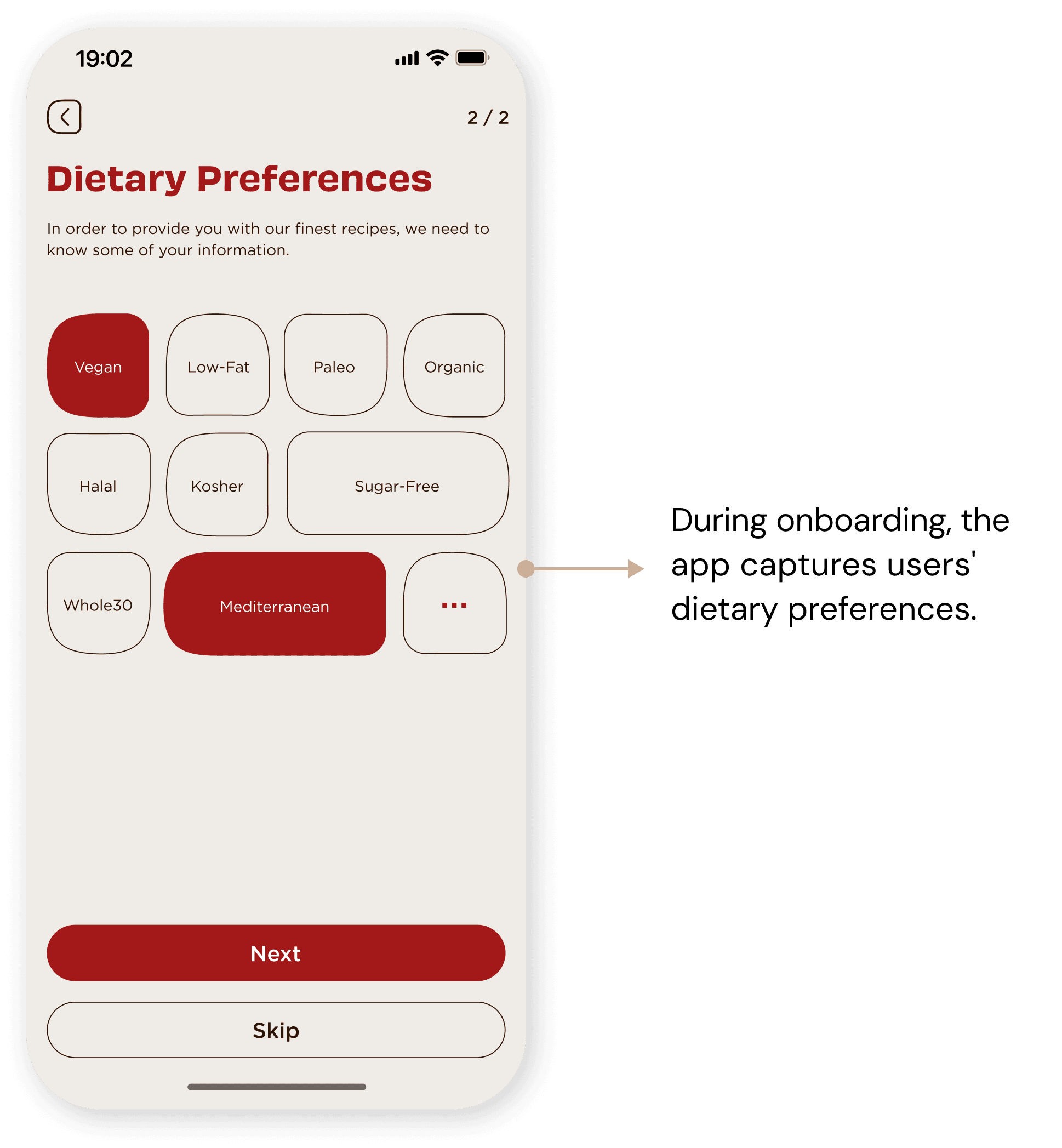
During the sign-in process, the app not only records users' basic information but also, with their consent, keeps track of their allergies or dietary restrictions, as well as dietary preferences. After onboarding, users can directly access the home page to place orders.

Start Order
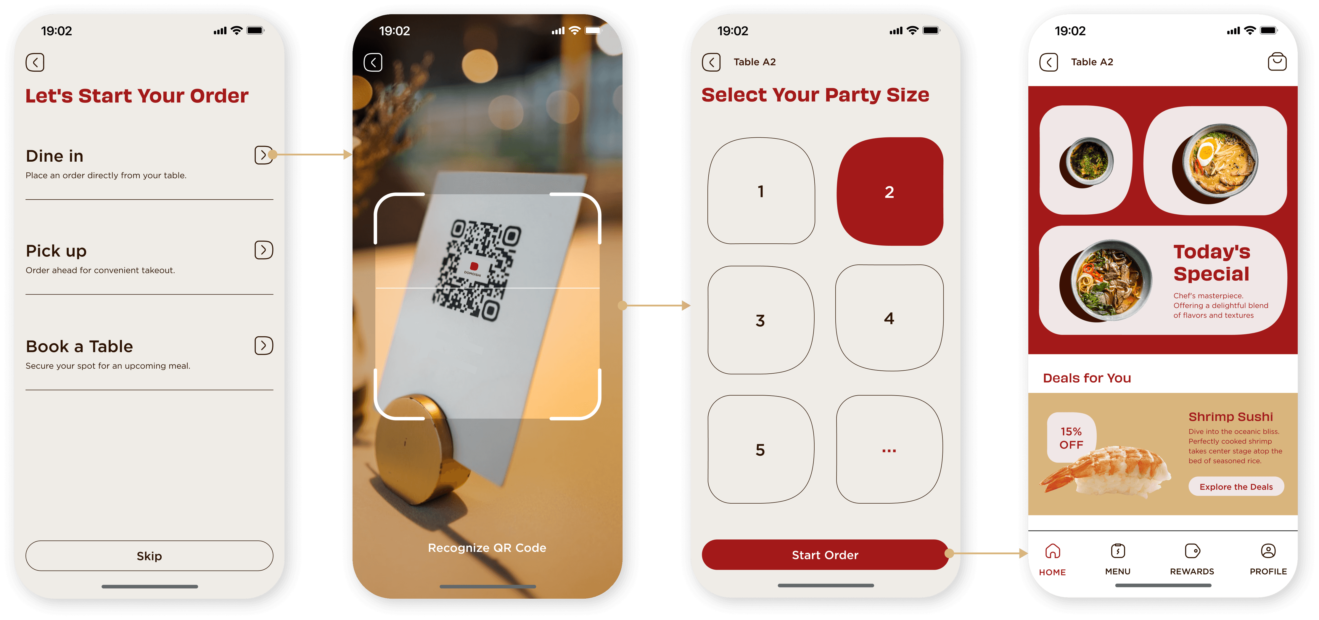
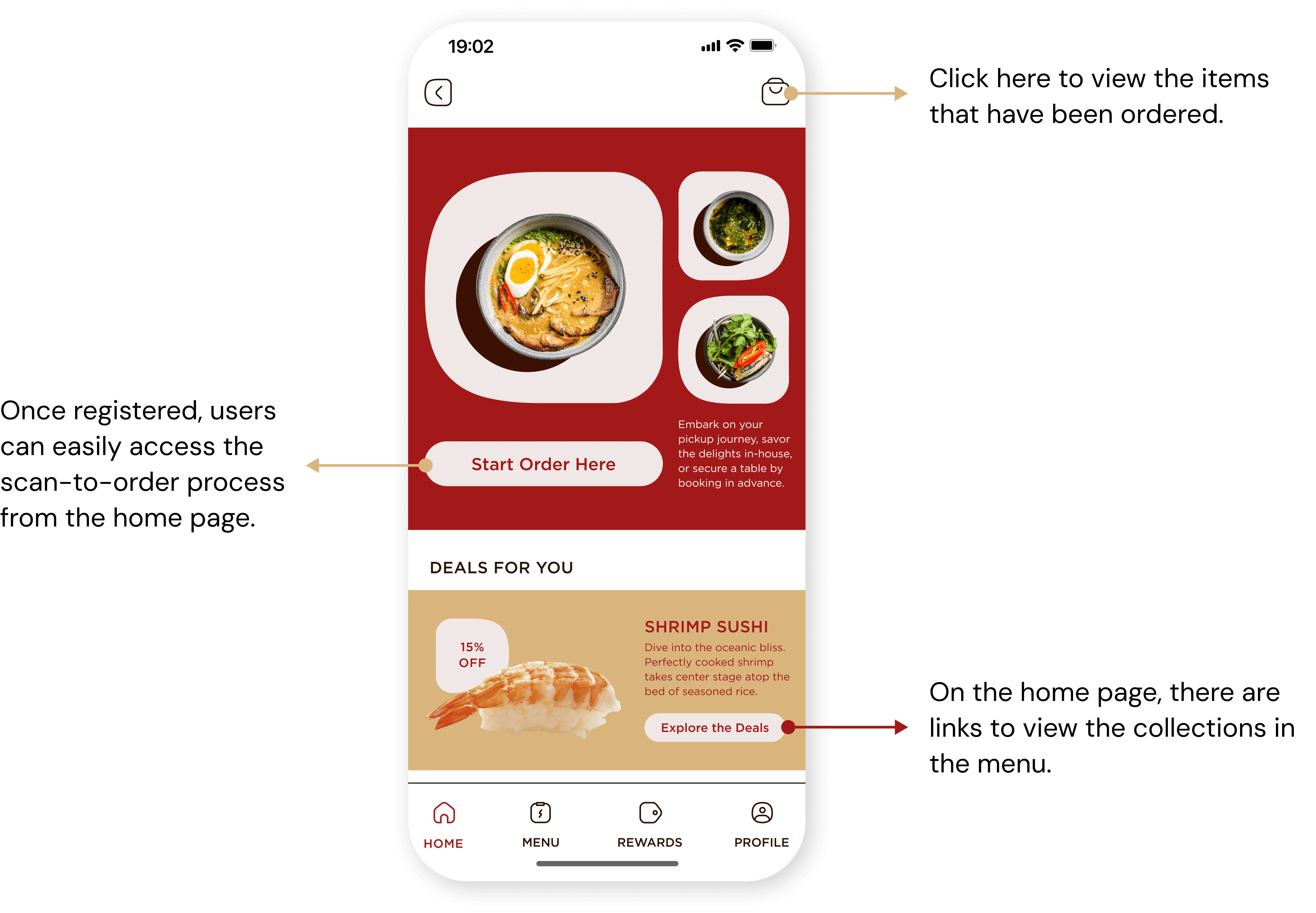
On the welcome page, users can start ordering or book a table without logging in. For dine-in customers, after scanning the QR code to input the table number and selecting the number of diners, they can begin browsing the app pages and menus.
Special Dishes
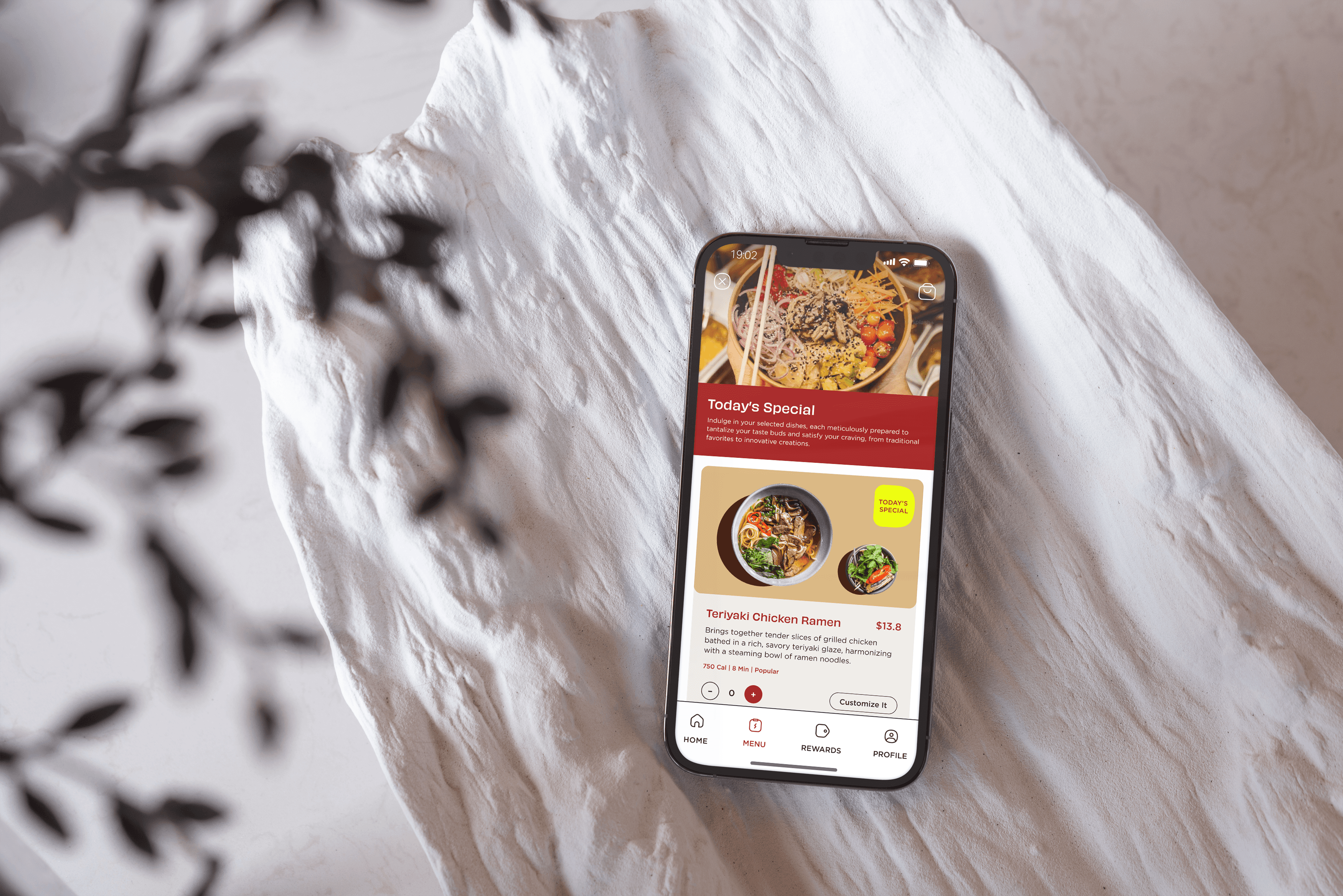
To effectively highlight special dishes, a link on the home page provides users with direct access to video demonstrations showcasing the preparation of these dishes. Watching the chef perform ingredient handling and cooking is also a characteristic of Japanese kitchen culture.


Previous Orders
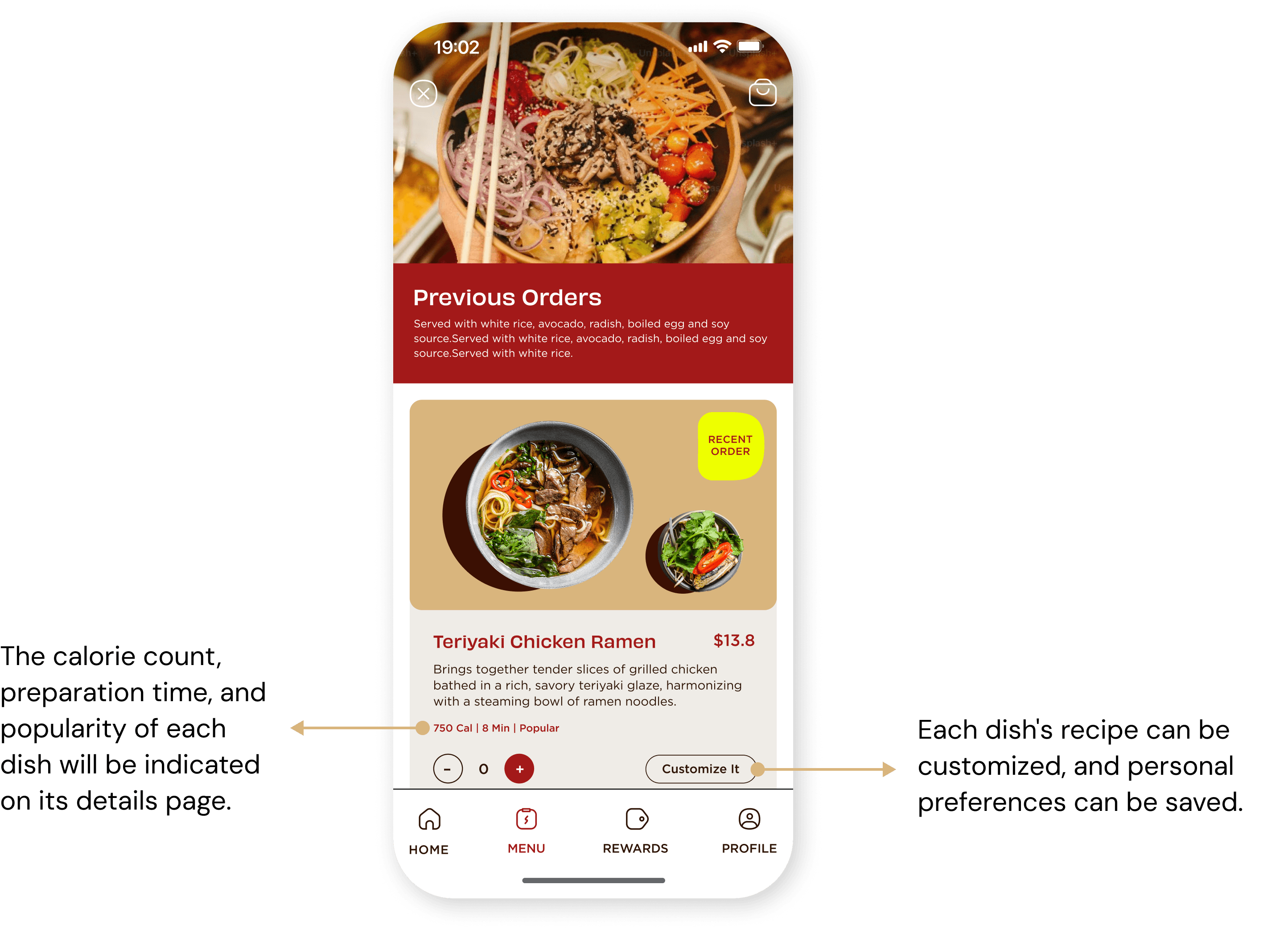
The app will help users keep track of recently ordered dishes, making it convenient for users to quickly select options they have already tried. From the menu collection page, users can access previous orders.
Chosen for You
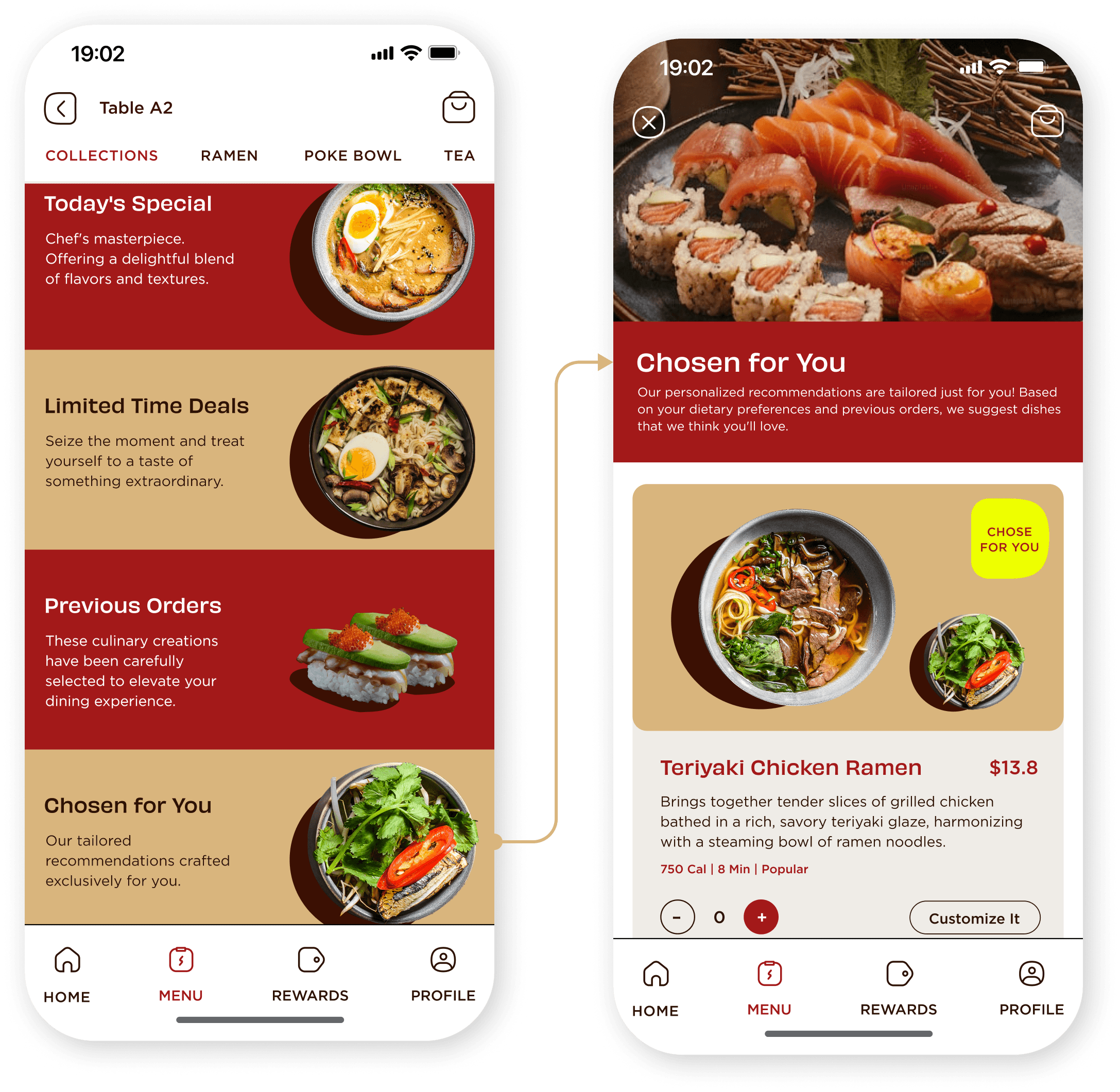
During the onboarding process, the app records users' dietary preferences. Based on this information and previously ordered dishes, the app will recommend dishes that users may like.
Allergies
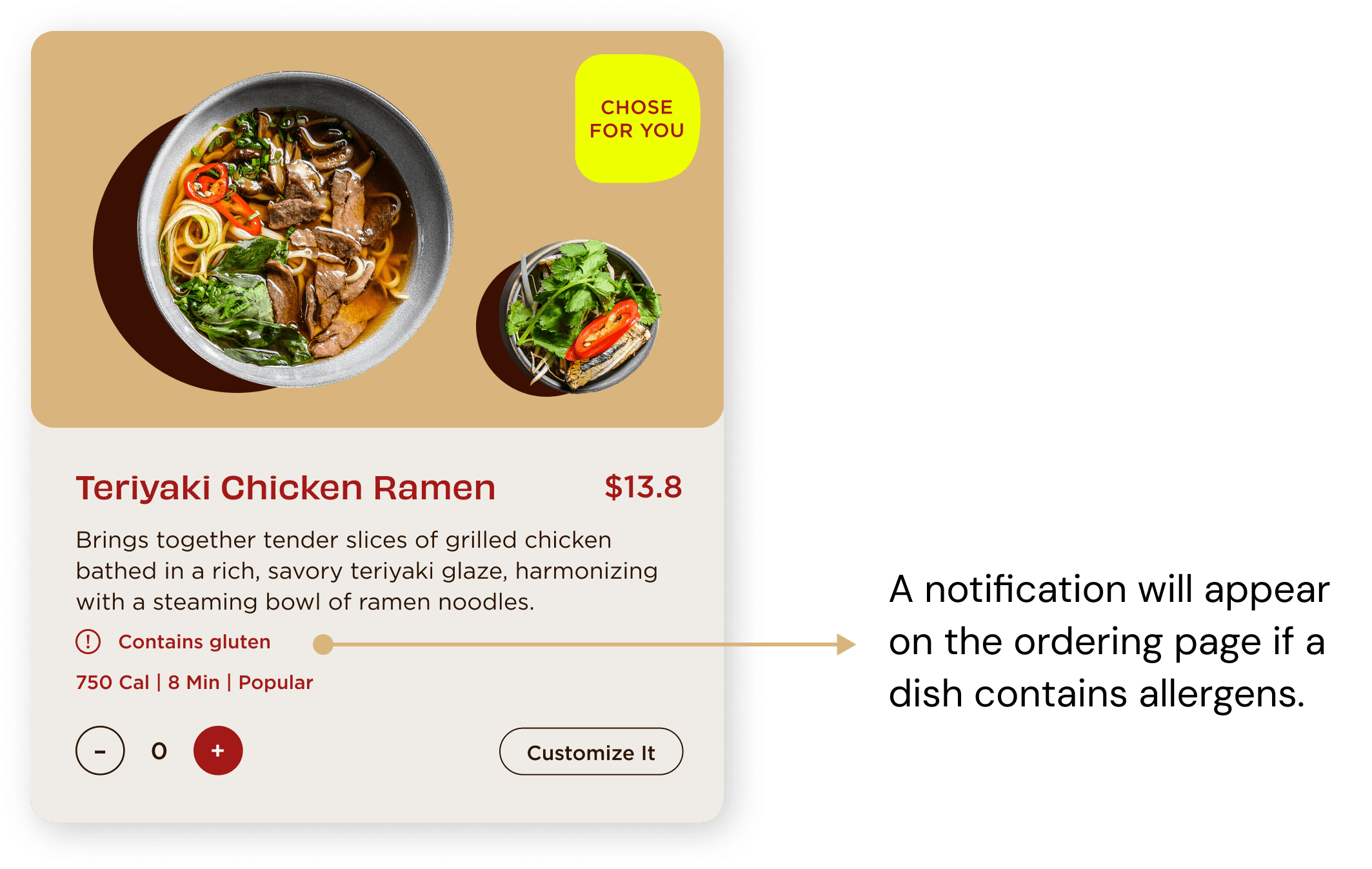
The app records users' ingredient allergies. If a dish contains any allergens, there will be a notification in the food ordering page.
Create Custom Dishes
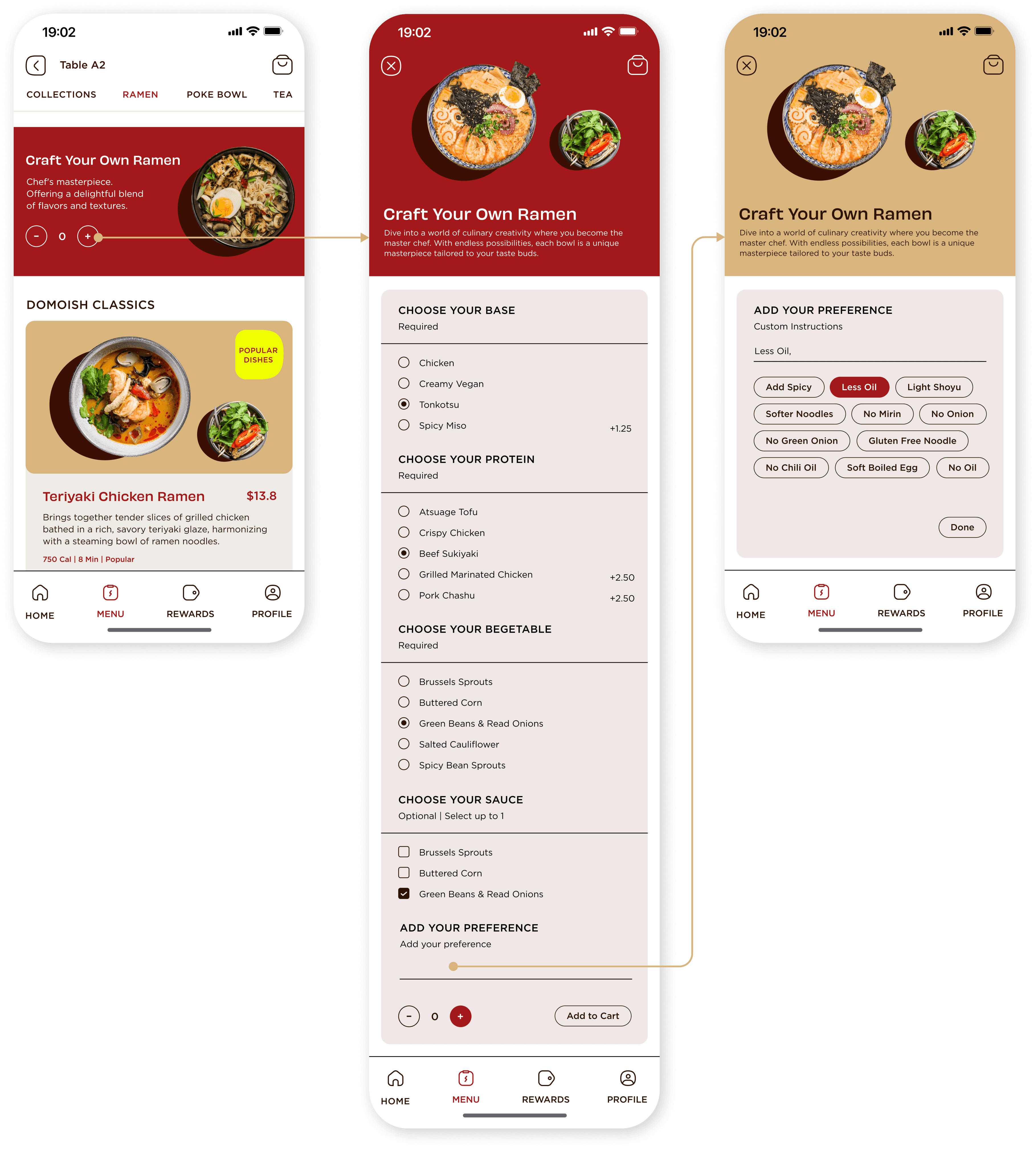
On the menu page, users will find a dedicated section for custom dishes. By clicking on this section, they will be guided through a step-by-step process to craft their unique meal. Additionally, users have the option to input notes regarding their specific preferences, ensuring that their meals are tailored to their tastes.
Transparent Waiting Time
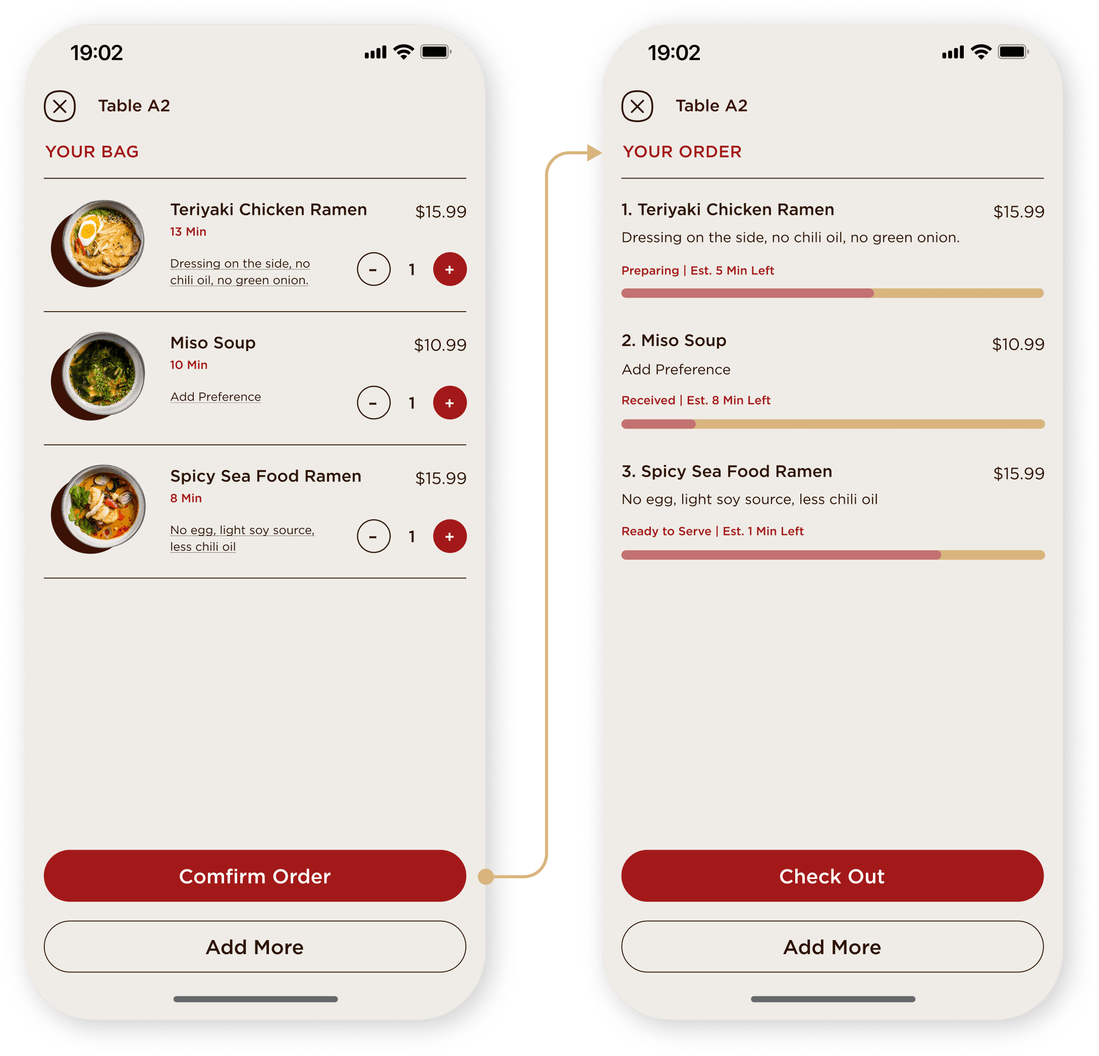
On the ordered dishes page, users can see the progress of each dish being prepared as well as the remaining wait time.
Take Away
Reflection
In this project, I had a valuable experience developing an intuitive and seamless ordering experience based on extensive user research and feedback. By integrating features that allowed users to monitor the preparation progress and wait times for their orders, I realized the importance of keeping users informed throughout their journey. This transparency not only improved the overall user experience but also fostered a sense of reliability and trust in the app. This experience underscored the value of clear communication and real-time updates in building a positive and trustworthy user relationship.
Next Steps
For this project, I primarily focused on the mobile screens. Next, if I have more time, I plan to complete the restaurant's iPad ordering system. The iPad ordering system will streamline the in-restaurant dining experience, making it easier for servers to take orders and for customers to customize their meals directly from their tables.

